COVID-19 Data Misrepresented by Georgia Health Department
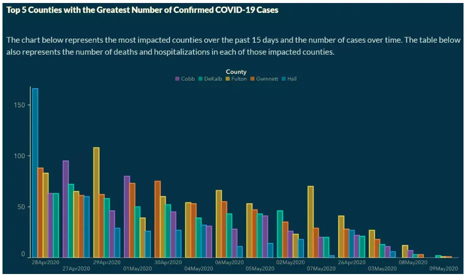
On May 13, 2020, the Atlantic Journal Constitution reported that a graph published by the Georgia Department of Public Health in or around early May misrepresented trends in the number of confirmed COVID-19 cases. The graph (reproduced below) showed the number of confirmed cases in the five counties with the highest number of infections. Due to the way the data was sorted, the graphic appeared to show a consistent decline in the number of cases in all five counties, over two weeks. However, the x-axis was not arranged in chronological order, but rather with the highest number of cases clustered on the left and the lowest on the right, regardless of when they occurred.
A spokesperson for Georgia Governor Brian Kemp said there had been a "mistake" and blamed an outside vendor. According to the spokesperson: "The x axis was set up that way to show descending values to more easily demonstrate peak values and counties on those dates. Our mission failed. We apologize. It is fixed." Critics have, however, expressed concern that the Department of Public Health may be trying to hide data that calls Governor Kemp's re-opening plans into question. State Rep. Jasmine Clarke told reporters: "I have a hard time understanding how this happens without it being deliberate. Literally nowhere ever in any type of statistics would that be acceptable.” The Governor's office rejected those claims, saying: "We are not selecting data and telling them how to portray it, although we do provide information about constituent complaints, check it for accuracy, and push them to provide more information if it is possible to do so."